-
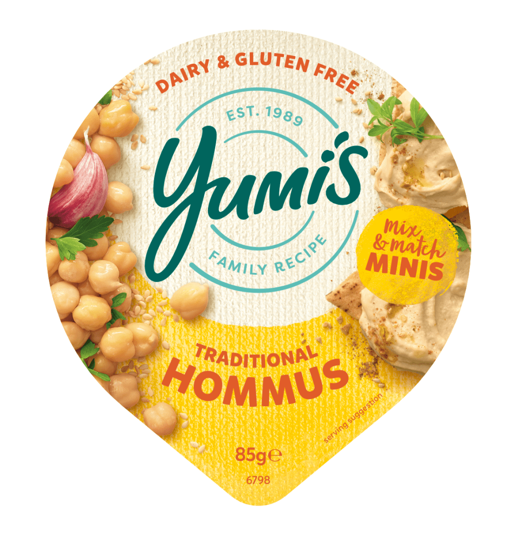
For this project I worked alongside Kelly Boulton to create a new variation of foil lids for the new Yumi’s Mix n Match Minis line. I helped add and adjust assets and details, for each different foil lid. Each adjustment went between Kelly and the Yumi’s to be approved and given feedback notes until it
-
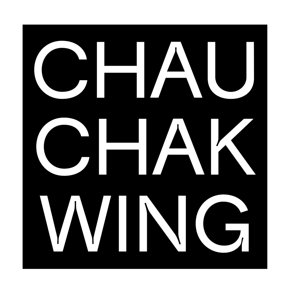
This project was part of a conceptual brief to create a series of wayfinding icons for a preexisting estalnishment. I chose the Chau Chak Wing Museum, located at the University of Sydney. RationaleI have used the typeface ‘Trap’ to create my logotype and corresponding icons for the Chau Chak Wing Museum. I felt that this typeface had
-
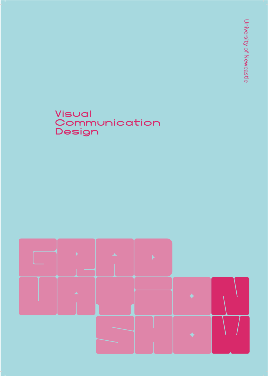
https://www.viscom23.com& https://www.instagram.com/uonviscom/ Grad Show ’23 is the University of Newcastle’s Visual Communication Design Graduation Show / Exhibition. This project had many aspects including a publication, website, social media, print media, and the final event. The initial idea for the Grad Show’s visual identity was centred around the letters ‘N’ & ‘W’ looking like a ‘2’
-
The Limpid Minds Exhibition is a conceptual art exhibition created for me to experiment with kinetic type and transparency within design. I have applied my visual identity to various print mediums to display the identity in use.

-
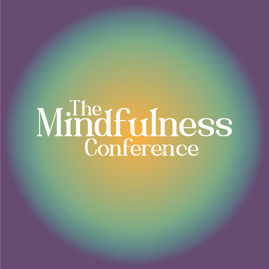
The Mindfulness Conference is a conceptual, wellness conference based in Newcastle. It involves a multitude of events and activities to increase personal wellbeing and mindfulness for individuals and businesses. The design intention was to communicate the notion of ‘wholeness’ and connectivity through the circle motif; meditation circles, auras etc.
-
Jungle Island is an app prototype developed for a fictional tourist destination based on the game, Super Monkey Ball Adventure. It was designed to promote the island and aid the user organise and manage their stay, providing information about the island, available activities and a booking system. It was designed to be an easy navigation

-
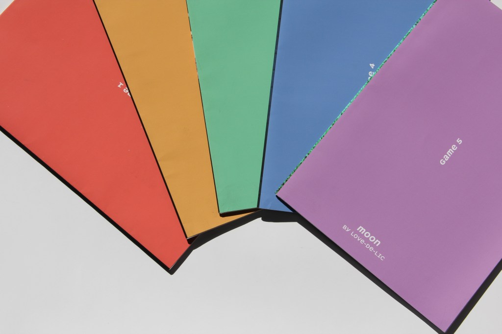
‘Story-based RPGs’ is a transparent envelope style book with a cardboard slip case. It utilises 110gsm tracing paper folded and taped to construct a sleeve. 5 of which have been bound together by scotch tape to create the ‘pages’ of the book. Each sleeve has been die cut with a number and contains a brightly
-
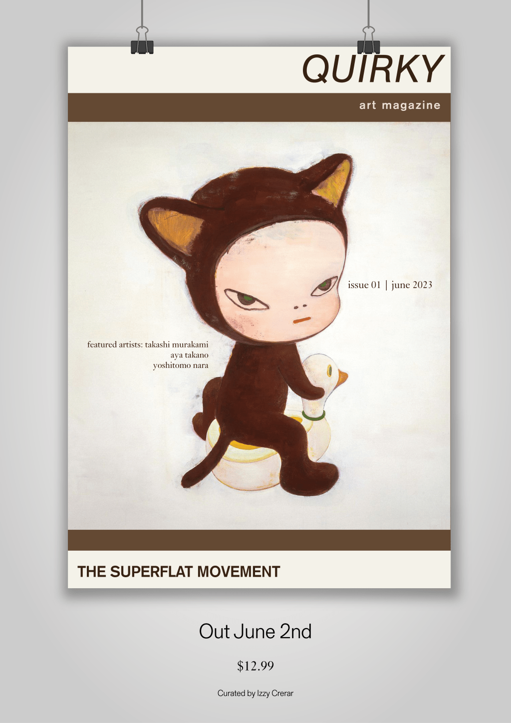
‘Quirky’ is a 24 page art magazine, a4 (210 x 297mm) size and saddle stitch bound. 100gsm glossy paper. The design intention was to create spreads that emulate the immersive experience of walking through a sophisticated art gallery. Each page was meticulously curated to present the featured artworks as the primary focal point, with generous
-
A series of abstract floral illustrations, partially organised by the Australian seasons. Using graphite & charcoal textures, soft gradients and stark grayscale contrasts. Subtly gridded letters & numbers form a simple monthly calendar.

-
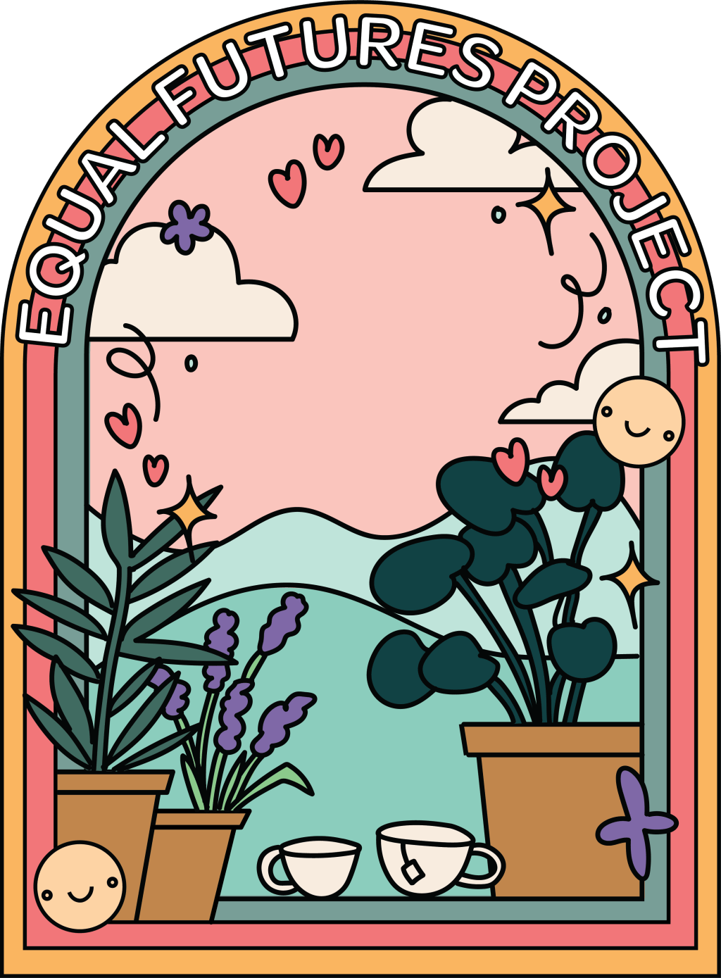
Equal Futures Project (EFP) is a non-for-profit organisation who’s mission is to champion equality and diversity in workplaces, homes & community throughout the Newcastle & Hunter region. This is a conceptual branding for EFP and demonstrates my designs in a range of formats.
-
Subscribe
Subscribed
Already have a WordPress.com account? Log in now.
